Tuesday, 5 May 2015
Brand Evaluation | Giorgio Armani Beauty
Giorgio Armani, a brand that is most commonly known for it's clean cut staples, and perfectly tailored menswear, and was founded by the silver fox himself, Giorgio Armani. Armani was born in small and quaint Italy circa 1934 where as a fashion designer he developed by combining authentic Italian quality with modern day fashion. Giorgio Armani as a brand, has excelled in quality and diversity over the years, with such a successful name, Armani caters to a range of fashion essentials, including Menswear, luxurious Womanswear, a line dedicated solely to Jeans, Makeup, Beauty and more infamously, perfume for both men and women. As he progressed as an designer and a profound business man, Armani ventured out and not only creating a line dedicated to sale items (Armani Exchange, Project AX 1991), but also begun to target a younger client base and audience. Making his brand immediately more complex and leaving his overall brand in extremely high price margins.
To pin-point Giorgio Armani's target audience would be easy in regards to class, but not so much age and gender, as just an example of the sort of money you need to purchase a garment from Armani fashion. In 1982, a reasonable and fashionable jacket by Armani would retail for around $250-400, making it a more luxurious fashion statement of the eighties. By 1988, a fabulous Giorgio Armani suit would acquire an uncomfortable $1,800 price tag- although I hear that the suits were very comfortable in material and quality, a more relaxed vibe.
More relevant to this unit, and my course in general is the underestimated, and unappreciated Giorgio Armani makeup and beauty collection. A collection so sleek and trendy, the packaging and products sit somewhere in between a combination of MAC Cosmetics and Chanel. Their price points are standard fashion makeup price, and the perfumes are expensive, much like Guerlain Fragrance prices. Whilst being a premium makeup brand, there are some reasonably affordable luxurious products that are available internationally, and more specifically to the UK, Armani Beauty is available only in high market department stores- which also adds to what kind of image the brand is portraying.
Promotion has been key for Giorgio Armani beauty, because it's important to get away from the fashion path when it comes to makeup, you really create based on trends and popularity. With this in mind Armani has worked with well-known models, and more importantly for their success- many celebrities. Having Megan Fox as the face of their beauty campaigns, triggers circulation to their brand from all ages because lets face it, every women wants to be Megan Fox. In regards to promotion and advertisements, Armani has worked with Beyonce, Victoria and David Beckham, Kate Blanchett and even Cristiano Ronaldo.
Overall, Giorgio Armani nearly 80 years on is still keeping up with trends, continuously working on their brand and furthering their target market- making them more current than ever! Their clothing and perfume line needs no justification of price and popularity because the quality and legacy speak for themselves, however I personally think the Makeup range will blossom into the new generation when it comes to purchasing elegant products and will eventually become just as popular as the other segments of the brand.
"Giorgio Armani." Encyclopedia of World Biography. 2004. Encyclopedia.com. 5 May. 2015<http://www.encyclopedia.com>.
n/a. (2015). Giorgio Armani Biography. Available: http://www.biography.com/people/giorgio-armani-9188652#personal-life. Last accessed 24th Feb 2015.
n/a. (n/a). Giorgio Armani Beauty. Available: http://www.armanibeauty.co.uk/make-up/face/spring-glow.aspx. Last accessed 16th Feb 2015.
Nail Ad Photoshoot + Critical Analysis
PHOTOSHOOT + ANALYSIS


CRITICAL ANALYSIS & OVERALL THOUGHTS
This shoot by far took the longest to plan, and achieve. As you can see from the images, the gobo lighting looked incredible and really gave that Armani Beauty factor that I wanted. My model was a natural beauty with flawless freckles that added such depth to the final images and overall look. The makeup compliments the model's eye and face shape, and more importantly adds such glamour to such a dark but fabulous concept. The lips for this look stayed on through coffee, fidgeting and eating- what are models like? The red shades against her pale skin worked in my favour to compliment the shadows, and stand out amongst all the lighting and darkness business. Like everything, there is plenty to criticize. The nails and hands of my model were difficult to work with because they are not very feminine and the nails that my model already had on were fairly long and see-through. When applying colour to them the thin, plastic nail design was still visible underneath three coats of OPI red.
Overall, I feel the outcome of this shoot is well thought out, I have considered all aspects of design, including what positions to place darkness in, what patterns to create gobo light with and how choosing red would not only radiate my models skin, but compliment the light and shadow of the photos.
Nail Ad Hairchart & Practice
HAIR CHART + PRACTICE

- Hair Protector and Shine Serum.
- Straighteners.
- Paddle Brush and Comb.
- Hairspray.
- Hair Donut.
- Hair Grips & Coloured Hair Bands.
For my Nail Ad design, I really wanted to channel that inner hair stylist that I knew has just been dying to come out. This isn't something we learnt in class or even something I had done before, but by looking at it, the structure and precise hairs that ravel into a bun- I knew it would be perfect for creating something sophisticated. In a way, it's not about the hair being seen, but knowing that I am developing in skill and trying new things should really show how much thought I put into this design. The hair will be slicked back out of the face, which fall into one with the shadows of the gobo lighting and frame the face of my model.


Upon reflection, I feel that the plait works nicely incorporated into the bun, adds a little something extra, don't you think? More than anything, I need to work on making the style as smooth and slick as possible, as I don't want baby hairs to be peaking through the light and shadow of the gobo shoot. Although in the final shoot, I need to work as much as possible in styling the hair to get a straight finish, I think this hair design is sleek and perfect for my Giorgio Armani Nail Ad.
Nail Ad Design + Moodboard
FACE CHART + MOODBOARD
I really want to make it clear, that I completely understand that people would expect me be to be doing a perfume ad to represent my chosen brand- Giorgio Armani. However, why would I want to do what people expect? Planning this shoot in particular required the most thought and really challenged me to think of something different and unique. I wanted to inc-operate shadow and bright colour, as used in previous lip campaigns I have researched. With this I had in mind a concept that was coordinated in lip and more importantly nail colour, as this will in fact be a nail ad.

GOBO GALORE
Gobo lighting is a concept that me and my chosen photographer had discussed but are hesitant to use, simply because there is only one gobo light as university amongst thousands of students. If this wasn't tricky enough, we also need to decide on a whole concept, pattern to create shadow with/ against. It takes a lot of planning and work to get the shadowing right, and the lighting at the right balance. The reason I want to really use this photography technique is to create a striking shadow, some texture in the shadows and more importantly, to really make my design pop.
LADY IN RED
This whole concept and idea of using red initially, came from being inspired by the Giorgio Armani lips advert that involved beat boxing (see previous posts). I want to really bring out the coordination of lips and nails for the ad, and make them stand out in the shadow. For the lips I will be using a matte red lip colour, that will vary in tone according to my model's skin colour. Ideally I would like to use a pure red, that isn't dark but isn't a brick red with blatant blue undertones. To match this I will be using a pure red nail polish and a minimal, soft brown cut crease look- very Miss Monroe.
DONUT & PLAIT
For this design, I most definitely want the hair out of the face, but still looking chic and slicked back. Although the hair won't be the main focus of the shot, I still would like to experiment with my hair skills, show development and show that I know, what works best with what. Although the hair looks reasonably easy because I will be using an accessory, it in fact challenges me in regards to getting it up in the right position, making it slick as possible and most tediously- dealing with baby hair.

Despite the hideous smudge you can see quite obviously on this face chart, it is in fact the design I chose to go for, for my Giorgio Armani Nail Ad Shoot. The skin will be matte and slightly more flawless in coverage in order to create the perfect contrast against the gobo lighting and shadow. I will use a powder bronze shade to contour the skin beautifully, and sculpt it as my model has a fairly rounded face. For the eyebrows, I want them to be full but not a scouse brow in any way, shape or form. MAC 'Cork' or 'Espresso' are usually a perfect combination for filling in medium to dark hair. The eyes will be primed with MAC 'Painterly' paint pot, which will act as a base skin-tone colour for the lids. I will be cutting the crease with a mixture of both 'Soft Brown' and 'Espresso' by MAC.. again- can you tell I like these shades? I want the lid to be completely bare to contrast the crease, almost like an old Hollywood eye look. Monroe eat your heart out. The lashes will be wispy with a light coating of mascara, a natural flare that will still add length and volume. Finally, for the lips I will be using Kryolan Aquacolor red shades mixed to create a perfect matte red shade for my model's skin tone. I chose to use aquacolor because it stays in tact for a ridiculous amount of time, doesn't look pigment or finish AND applies precisely to create shape.
Overall, I am very pleased with the outcome of my design, minus the large black smudge. I feel like this whole look comes together really nicely, and adds a more glamorous effect to my Giorgio Armani portfolio. I felt the choices I have made are very appropriate to my chosen brand, and more than anything I actually gained inspiration for this shoot first and foremost, from Giorgio Armani beauty, and their products. I feel the red is a great link to the Rouge Ecstasy and Lip Maestro range, coordinates with these red packaged products and can be associated with that infamous red lip.
Summer/ Beach Photoshoot + Critical Analysis
SUMMER/ BEACH PHOTOSHOOT + CRITICAL ANALYSIS


CRITICAL ANALYSIS & OVERALL THOUGHTS
More than anything, I am so pleased with the thought and planning put into each outfit, these outfits are very much inspired by the Giorgio Armani Spring/ Summer 2014 collection- sheer materials and pattern galore. The beautiful model's skin is bright and radiant against the whitish/ beige backdrop. As you can see from the final images, my model's hair was insanely thick and long which leads to the criticisms of this final look (in regards to the hair anyway). The hair was successfully somewhere in between straight and wavy, as planned and even had that sea salt spray/ beach texture BUT, was extremely hard to cover the hair completely, and and actually keep it in style throughout the photo shoot. The top half of the hair is what I wanted to achieve through scrunched and applying styling products, but the bottom half is very blatantly more straight than planned.
Overall I felt my design was subtle, effective, radiant and very reminiscent of my own take on previous Giorgio Armani looks. The eyes are perfectly bronzed with an 'eye and lip gloss' applied over to create even more shine to the lids, and the lips are a perfect tone of pink to compliment my dark-haired model and her porcelain skin. I feel like the whole organisation of this shoot, the styling and photographer, and even the fan used to add a wind-swept effect to the hair have all been thought about in depth and have helped towards the final outcome of the images.
Overall I felt my design was subtle, effective, radiant and very reminiscent of my own take on previous Giorgio Armani looks. The eyes are perfectly bronzed with an 'eye and lip gloss' applied over to create even more shine to the lids, and the lips are a perfect tone of pink to compliment my dark-haired model and her porcelain skin. I feel like the whole organisation of this shoot, the styling and photographer, and even the fan used to add a wind-swept effect to the hair have all been thought about in depth and have helped towards the final outcome of the images.
Summer/ Beach Hairchart & Practice
HAIRCHART + PRACTICE

- Hair Dryer.
- Diffuser.
- Moisture Spray/ Curl Spray.
- Mousse.
- Sea Salt Spray.
For this style, I didn't want majorly curly hair but more so, somewhere in between curly and straight- but still wet. I feel this hair style is appropriate because it centres around that theme of high fashion/ beach concept and also, natural beauty hair is something that Armani have shown in previous campaigns. I gained much inspiration for this from a mixture of the catwalk clothing/ style and makeup, and the hair was inspired by the Giorgio Armani Acqua di Gioia Perfume ad where the hair of the model is wet-look and is just fabulously not in place.


Upon reflection, I actually really like this idea of wispy, wet hair, that just looks like the model has come out of the ocean, laid in the sun for a bit and been photographed. For this look I really need to focus on the messy structure of the hair, and see how it sits and photographs. A problem I had when trying to re-create this hairstyle was actually maintaining the curls, and wetness throughout the procedure. This means that throughout the photo shoot and when finalizing the look and taking images, I will have to have the sea salt spray mixed with moisturizing spray and water at hand, ready to re-apply and mess up.
Summer/ Beach Facechart Designs + Moodboard
FACE CHART DESIGNS + MOODBOARD
When designing my beach/ Summer high fashion shoot, Beach was quite clearly a very prominent word to consider. I wanted this design to give off not only a very beachy, tousled hair, shimmer galore concept, but also wanted the designs and styling to capture how Armani would really do Summer fashion- and it doesn't include your stereotypical beach shoot. When researching I found that in previous Summer Campaigns, Armani either channeled perspiration made glamorous or high fashion, sheer material and a pretty face.

BRONZED EYES
Although many would have gone for the wet look, beachy vibe. More than anything what was important to me, was the bronze factor of my design. From the get-go I knew that MAC 'Amber Lights' combined with 'Satin Taupe' would be me go-to shimmer/ frost shadows for this look. I almost have a smoky eye set up in my mind, but the twist is there will no dark or smoky shades, just bronze and shimmer based shadows smudged on the lid- all the way up to the crease and on the lower lash line to really brighten the eyes and make them pop.
PINK LIPS
The idea of a pink lip combined with a bronze shadow look, will compliment each other perfectly and hopefully make the face radiate with beauty and dewiness. Whether or not the lips are dark or light, maybe even somewhere in between, they will still be pink and of a glaze finish to compliment the highlighting I will be doing on my model.
WET-LOOK, SCRUNCHED HAIR
For this hairstyle I really want to create natural beauty hair with a slightly wispy/ wet look finish. In order to achieve this hair I think it will be important to play around and work with different styling products and most of all.. salt spray. This way styling will be made easier and that beauty natural wave will be more achievable.

For this hairstyle I really want to create natural beauty hair with a slightly wispy/ wet look finish. In order to achieve this hair I think it will be important to play around and work with different styling products and most of all.. salt spray. This way styling will be made easier and that beauty natural wave will be more achievable.

The two face charts for this design have started out very similar, but the tones and colours used are different in both. Design #1 is somewhat smoky in the way the technique is applied around the eye, but minimal in regards to the mascara. For the skin, I have gone for a more bronzed base, with plenty of highlighting involved, using both cream and powder highlighter layered to achieve that radiant Summer glow. The brows will be filled in but kept very natural with this face chart design, the hairs will be emphasized through the use of brow gel and Vaseline, giving them that natural wet and glossy finish, perfect for a beach inspired shoot. the lips are dark bright pink, think NYX 'Louisiana' lipstick applied generously and finished with Jemma Kidd Eyes and Lip Gloss.
Design #2 is quite clearly more put together, although it's not as minimal as #1, it is still effective in portraying that beautiful bronzed concept. The skin is slightly less bronzed than #1, and more contoured in order to frame and show depth in the makeup. The brows like #1, are lightly filled and glossy using either MAC 'Cork' or 'Espresso' shadow to fill in sparse areas. For the eyes on this design, I applied a mixture of two eye shadows, both shimmer to the lid and blended them generously around the eyes. Using a bronzed and shimmery shade such as MAC 'Amber Lights' all around the eye will add shine and a beautiful glow to the eyes when photographed. Mascara is more apparent in the design, to add more of a flare and volume to the look. For the lips, I went with something slightly lighter in tone than #1, just to add a more subtle effect to the overall look.
Overall, although these two facecharts are very similar and involve some of the same tones and techniques, I do feel like design #2 will cater to more skin tones and different features. The first design uses a shimmery shade quite low done smudged into the lower lash line, and this can often make the eye area darker and older, as apposed to bright and glowy.
Thursday, 30 April 2015
Evening GA Photoshoot + Critical Analysis
Photo shoot and Critical Analysis


CRITICAL ANALYSIS & OVERALL THOUGHTS
So it turned out that my chosen model had very short hair, which threw me a bit of a curve ball in regards to slicking back layered hair; but it definitely worked out for the best because the hair and makeup really compliment each other. Beauty is radiant in the models skin which I created using a cream based foundation with a heavier coverage than usual. My model had problematic skin and layered short which proved challenging- but through this I was able to challenge myself, become more confident in my work and skills. There are certain aspects of this look that you can probably note as different to what I initially planned, and this was simply spear of the moment. Instead of using red as a prominent theme to compliment the black, I replaced it with nude and bare shades to compliment my model's skin and hair colour. The nails were then painted nude, as were the lips with a fabulous shine.
Overall I am more than pleased with the final results of my evening photo shoot. The smokiness of the eyes, the nudity of the skin complimented by the bare lips and nails, and finally the styling- all work together to create a mixture of high fashion meets androgynous beauty.
Evening Hairchart & Practice
HAIR CHART + PRACTICE

- Hair protector OR Serum.
- Hair Dryer.
- Paddle Brush and Pin Tail Comb.
- Straighteners.
- Hairspray.
- Gel or Wax (if the hair doesn't set).
For the evening part of my Armani beauty designs, I wanted to channel the inner high fashion/ androgynous side of things and more than the makeup, I wanted to portray this through the hair of my creation. I feel it's appropriate because it shows technique in getting the hair as sleek and fabulous as possible. To enhance and add volume to the front of the hair, I will back comb the front portion ever so lightly to then hairspray it back and make it as slick as possible. Depending on the length of my model, this hairstyle will frame the face and add a glamorous high fashion look to my images.


Upon reflection I feel that I have really got to grips with the technique of creating a flat, straight and sleek base to many different styles throughout my project. Although the appropriateness is on point, I really need to work on the back section from curling or loosing straightness, after I have applied product to it. This can be done with using a brush and hairspray to flatten the hair and combine both the top and bottom section.
Evening Facechart Designs + Moodboard
FACE CHART + MOODBOARD
The evening design of my project for Giorgio Armani beauty was to me, an important part of representing my chosen brand because as we found out from my research, Linda Castello believes that the smoky eye is everything in regards to making a woman feel sexy. Although creating something sultry and smoky is simple in technique, figuring out how to bring the whole look together is important because brows, lip and skin should all work harmoniously. From the get go, I know that I wanted to create a smoky eye, but how could make it more special? Here is my Evening mood board that represents elegance, sexiness and some what an androgynous beauty concept.

Overall I am very pleased and swaying towards my second design, simply because it's definitely more put together, displays my skills in regards to a glorious interpretation of the infamous Armani smoky eye and red lip. Although it looks brilliant and the idea plans out fabulously in my head, I am unsure about the red lip being too much for the overall look and would genuinely be happier trying a more nude, and bare lip. Another criticism I have of my design, is the smoky eye with gloss applied to the top of the lid could easily crease and separate during shooting, which means there will be plenty of touch-ups and attention to detail paid during shooting.
SMOKE GALORE
If you couldn't tell already, I'm doing a smoky eye. I want my model to ideally have fairy pale skin with any hair length that be slicked back. The smoky eye I have gone with is your standard combination of brown dimension full crease, accompanied with black smokiness and for a little something extra, some gloss applied to almost make the black more wet look.
MATTE, FLAWLESS SKIN
This moodboard shows a more matte finish in comparison to my previous looks, which doesn't mean heavier makeup but more coverage and a matte finish on the skin of my model. This will involve possibly using a cream based foundation and powder to make the look more suitable for the evening, shine free and very photogenic to suit Armani beauty inspired photos. This accompanied with the smokiness will look formal than the rest of my designs, it shows my depth and attention to detail in regards to what makeup suits what event/ concept.
PALE OR RED LIPS
This aspect of my moodboard and general design is uncertain at this moment. Although Armani are most commonly known for their wonderful smoky eyes and bold red lips- do they go together? This would be something I need to practice for myself and really think about it, because I don't want the matte full coverage skin combined with a smoky eye AND red lips to look tacky and too much. Although I really want to replicate Giorgio Armani beauty and brand, I still want my design to look beautiful and represent that elegant side of my chosen brand.
SLICKED BACK HAIR
Very similar to the hair I practiced in my technical file, and although it's very simple it's quite androgynous in a sense that it replicates a high fashion style. Using straighteners will be essential and styling products will give the hair that shine and structure it needs. I feel this hair is appropriate because it's modern, elegant and androgynous at the same time.
As you can see from the face charts above, for once, these are two very different looks. Design #1 has less contour going on with that flawless matte face, and the brows are filled in and brushed with Vaseline to create a natural structure. For the eyes I went for a more golden, bronze shade using MAC 'Amber Lights' all over the lids and blended up to the crease, using a soft brown as the transition colour between the lid and crease. Under the eyes I used a mixture of MAC 'Espresso' and 'Amber Lights'. This look is a lovely idea for an Armani evening look but is very similar to something that I wanted to create for my Summer/ beach shoot. In order to display skill and replicate that 'sexy' smoky eye that Castello is oh' so famous for, I feel like #2 would be more suitable. For the lips in #1 I went with a red lipstick to compliment the bronze eyes.
Look #2 is definitely more put together, displays a blended and still pristine smoky eye that is complimented with a brownish tone to mattify and make more natural and less harsh. The eyelashes have a generous coating of mascara, and the brows are kept very very natural, and almost minimal using eye shadow to fill in lightly, and Vaseline to add shine and set. In order for this smokey eye to be more sophisticated and different than just your average smoky eye, I added a glossy finish to the lids using Jemma Kidd Eye and Lip Gloss, which will work perfectly with the slicked back hair.
Overall I am very pleased and swaying towards my second design, simply because it's definitely more put together, displays my skills in regards to a glorious interpretation of the infamous Armani smoky eye and red lip. Although it looks brilliant and the idea plans out fabulously in my head, I am unsure about the red lip being too much for the overall look and would genuinely be happier trying a more nude, and bare lip. Another criticism I have of my design, is the smoky eye with gloss applied to the top of the lid could easily crease and separate during shooting, which means there will be plenty of touch-ups and attention to detail paid during shooting.
Wednesday, 29 April 2015
SS15 GA Photoshoot + Critical Analysis
Photoshoot & Critical Analysis


CRITICAL ANALYSIS & OVERALL THOUGHTS
As far as organisation and time management goes, I made myself and my team aware of everything that they needed to know in advance. My photographer and myself worked together with lighting and background concepts to decide what would photograph best and this involved the different shades of pink that were available for backdrops. Before shooting, I found myself worried by the overload of pink, but my vision excelled, and minimalism combined with the use of pink worked well in my favour. The skin is radiant in all the rights places, the eyes pop and the lips are perfectly pierced with a matching tone in the nail colour. In regards to hair, although I practiced before hand, I did still struggle with the position of the pony tail (whether it was too high or low). It consumed most of my time whilst shooting which shows that I should have practiced this near-perfect style more. The surface of the hair was smooth and shiny- everything I planned it to be, and upon reflection, I wish I would have made a conscious effort to remember stray hairs in the ponytail, especially after lots of movement. I think this look is very appropriate in my attempt to represent, and recreate Giorgio Armani beauty because it emulates beauty and prettiness, but is bold and elegant with the use of natural makeup and poses using hands.
Overall, I am very please with the outcome of this SS'15 design and concept. The skin radiates against the pale pink background and generally ties the whole look together- which was an important factor in this whole look. I was scared to create a vision this out of my comfort zone, and honestly, scared of creating something so pretty, but with organisation, persistence and practice I was able to create my vision and display something I am very proud of.
Overall, I am very please with the outcome of this SS'15 design and concept. The skin radiates against the pale pink background and generally ties the whole look together- which was an important factor in this whole look. I was scared to create a vision this out of my comfort zone, and honestly, scared of creating something so pretty, but with organisation, persistence and practice I was able to create my vision and display something I am very proud of.
SS15 Hair Chart & Practice
HAIR CHART + PRACTICE

- Heat Protector OR Shine Serum.
- Hair Dryer.
- Paddle Brush & Pin Tail Comb.
- Straighteners.
- Hairspray.
- Hair Coloured Hair tie.
For my SS'15 hair design, I wanted something that resembled previous Spring/ Summer looks from Armani but also demonstrated what I have learnt this year and how my skills have developed. During our tech classes, this pony tail was something I really struggled with, but after practicing I managed to get it right- after many attempts (and lots of hairspray). I thought this look was very appropriate because it would still look immaculate if executed correctly, and really frames the face whilst bringing the whole look together. The basis and primary idea of this style is to achieve straight hair, this will make the pony tail easier to create and can be styled more manage-ably.


Upon reflection I feel like the appropriateness of this hair design and style is perfect, but like mentioned in my tech file, when creating the final look for my photo shoot, I really need to work on positioning. The surface and general finish of this hair is perfect for what I wanted to achieve, but I actually needed to assemble the pony tail slightly higher up for a more modern and less droopy ponytail. I really like how sleek and shiny this hairstyle is, thank god dolls don't have baby hair eh?
Tuesday, 28 April 2015
SS15 Facechart Designs + Moodboard
SS15 FACE CHARTS & MOODBOARD
This particular mood board and designs are based on what research I have produced from Giorgio Armani Beauty. This can be anywhere from being inspired by previous Spring/ Summer campaigns and looks, to even just the general vibe and image that I have gathered from the brand. For this seasons Giorgio Armani catwalk look for SS'15, we witness that Armani have taken a more futuristic approach to stay on trend, with silver and brown minimal makeup. Although this was beautiful and on trend, I wanted to take my SS'15 design down a more 'pretty' path, using lighting, and even colours that I have never experimented with before. The look is simple but still demonstrates skill and product knowledge. Knowing what products to use and what works together best was ideal for creating this whole design concept, especially when using the colour pink. Here is the moodboard I have created that shows a general theme, hairstyle and makeup...

NATURAL SKIN
Not completely bare, but more minimal in a sense that you can still see the skins texture, and features. I chose to again, go for this makeup because from what I gathered through my research, is that Armani on most Spring/ Summer looks have used a very minimal product, but for my design I will not be using dewy skin- but still not setting with powder. This means that the natural tones, and oiliness of the skin can be seen through the makeup and can be used to look even more natural.
PRETTY IN PINK
As you can probably tell from the moodboard, pink is a very prominent feature in this whole design concept. Pink can be a very difficult to work with, especially even more so when used on the eyes. I want to do a soft pink lid, and apply pink smudged into the lower lash line. This can sometimes be a bit of a problem because pink can make you look tired so this is obviously something I need to try. I would like to also work with a pink back drop, it seems like pink overload but I plan to do it tastefully, not over the top. I chose to create this whole pink theme, not only to support my research of Armani Beauty linked to coordination, particularly being inspired by the Catherine McNeil ad.
SLEEK & CHIC HAIR
Like the Catherine McNeil SS'13 for Armani campaign, I want the face and makeup to really stand out, but of course no look is complete without a sleek and chic hairstyle to accompany it. I wanted to really represent my chosen and brand and their image through hair and a defined, slick ponytail with lots of shine will not only frame the face of my model, but tie the whole look together.

As you can see from my Facechart designs above, I have created two, so I am able to be critical of the two and find out which one is the better creation. I stated before that the two things that will be key for this design, is the reoccurring theme of pink, and simplicity. I would say that #1 is a starting point for this whole SS'15 concept, with natural skin, more prominent contouring that #2 which no blush. The brows stick to the whole natural theme, and whilst being filled in very lightly, they are natural in a sense that you can see the hairs and shape. I will also be using Vaseline to tame and enhance the shape of my model's natural brows. For #1 I mixed a combination of blushes to create a more subtle, blendable shade of pink and have applied that to the lids. To avoid tired eyes, I have used a mid-tone brown shade smudged into the lower lash line, and a brown mascara to enhance the idea of natural beauty and make the look as minimal as possible. For the lips I used a bright YSL lipstick that still sticks to the theme of pink, but adds contrast to the whole looks because it's a different shade.
The second look for my SS'15 design is definitely more put together and really stands out in comparison to #1. For #2 design, I added MAC 'Pink Swoon' blush to the cheeks, which are also less contoured, leaving the skin to speak for itself. On the eyes, they are the same as #1- which is a mixture of MAC 'Pink Swoon' and 'Fleur Power' blush complimented with a reasonable coating of black mascara. This adds more emphasis to the yes, especially with the white eyeliner that really makes the whole look pop. I then mixed both blushes again with a mid-tone brown and applied that to the lower lash line, so that the white would really pop, the edges would blend together and yet there would be no sign of tired eyes. The brows are kept natural, and still slightly filled in (very similar to #1). To finish, I then used a darker pink lipstick in comparison to #1, which is also matte to add definition to the lips and draw more attention to them.
Overall, I am quite clearly swaying more towards #2 which I feel will display my skills more effectively and generally looks much more thought through (which it was). I hope that my efforts of research in coordination and thinking out different tones of the shade pink, will show the contrast of not only a matte lip and eyes, against a natural skin finish, but also the contrast in different shades of pink.
Saturday, 25 April 2015
Daytime Test Shoot + Critical Anaylsis

PRACTICING MY DAY-TIME DESIGN
The image above is probably, a small clue as of to what design I've gone with. Reasons being, in simple form: I liked a lot more than the second design and felt it would work on a number of skin tones and faces- it's more universal and less harsh because I used very trendy/ fashion show favored cream products for the first design, making it more current and almost linking it to some Armani products that I have researched already. This practice/ test-shoot was perfect for really getting me into the project, of course testing my makeup design and really giving me a feel for this project, because before now it's mainly just been a lot of research. Everything I created on this day was exactly what I intended to re-create for my actual final shots, except the model. My model in class was a fellow student Judit, whom has skin and hair to-die-for but for this test shoot, with 40 minutes given to create the makeup, we were not required to re-create our chosen hair styles. Here are some pictures of the test shoot...


CRITICAL ANALYSIS & OVERALL THOUGHTS
Time management and confidence in application, seem to be something I am getting really good at. I finished this look and photographed it in around 30 mins, which is great for timed assessment practice. I was so thrilled with the skin finish of my design, it's dewy in the right places and more importantly there is that brightened, highlighted effect that I spoke about, on the bridge of the nose, cheekbones, cupids bow and the chin. Creating light in the right places and making her look radiant and almost really healthy! Although health isn't what I am promoting. There are other parts of the design that I have to be very critical on myself about because if I'm not, how can the makeup improve? Although I did apply medicated lip balm to Judit's oh so chapped lips, I did in fact apply it half way through application which it was no where near enough time to sink into the lips and really give them moisture. Because of this, when I applied my chosen shade of lipstick, they were slightly cracked and wouldn't take to grips with my glaze finish lipstick. This look is very natural is definitely something I picture being part of the Giorgio Armani Beauty Brand. The idea was to look at Day-time makeup, and by experimenting with dewy skin and neutral tones, I have done this. Through my research Cantello speaks about this idea of making women look and feel sexy, by adding sultry taupe and smudging it in under the lower lash line, I added some sexiness to a very natural makeup look.
Overall I am very pleased with the outcome of this test shoot, with the exception of my model having a lack of eyebrows, I feel like the skin and general application is a great starting point towards my final beauty shots! It has helped for me to know immediately when designing what products are going to work, whether I should use cream or powder. In this case by using a mousse type cream shadow from YSL, it almost added an extra shine to the eye lids, which brings the look together.
Daytime Hair Chart & Practice
HAIR CHART & PRACTICE

- Heat Protector & Shine Serum.
- Hair Dryer.
- Brush of Choice.
- Straighteners.
- Hairspray.
- Pin Tail Comb.
When designing my hair chart for my assessment, and Day-time makeup design, I had something simplistic, minimal and sleek thought out. After researching and collecting research from Giorgio Armani beauty, and gaining inspiration I designed and created this hair design. The structure of this style is very flat and straight, with a distinct side parting to help frame the face, and add something extra to the style. Using serum and hairspray to keep it in place, tucked behind the ears and as smooth as possible. Straighteners are essential for creating that sleek, smooth finish!


Upon reflection, whilst creating this hair style I managed to straighten this difficult doll hair and produce a smooth finished style. The appropriate of this hair style to me, is very relevant to the whole image and brand that is Armani Beauty. When creating this style for my final assessment, I really would like to work on the ends of the hair being even more straight- even after product is applied. Which in this case, made it slightly flicked at the ends. Other than this, I am very please with my choice of products and how they styled the finished look. Also with how sleek and smooth the hairstyle is overall with the side parting to frame the face.
Daytime Facechart Designs + Moodboard
DAY-TIME FACE CHARTS & MOODBOARD
So, this is when the designing aspect of my work comes in. Through this post I will unfold some ideas of props, accessories, moodboard theme and most important- face chart designs. In the next post I will talk more in depth about my concept behind the hair, practices, and products that all go towards the hair design of this Day-time Look. These designs and mood boards are based on my research of the brand, previous campaigns and looks by Giorgio Armani, as well as products I have an understanding of. The whole idea of the beauty look for me is definitely a more natural idea, no over the top contouring or scouse brow- just simple bare skin with tones and products that can compliment anyone. I wanted my look to be very simple, no props but still incredibly sleek and sexy, and this of course will be defined by my model and the hair and makeup I choose. Here are some features that I would really like to inc-operate into this design, and my final images:

BARE SKIN
An aspect of photo shoots that I have particularly liked using in previous projects and shoots. I feel that bare skin would work perfectly with this day-time look because it will not only compliment that very 'natural beauty' theme, but will coordinate with the makeup and hopefully if I find the right model, will really bring out strong features against a white background. If bare skin is used when shooting I will conceal any redness, piercings, tattoos and imperfections, and will add my handy Body Shop Highlighting Cream mixed with moisturizer all over the skin to add a beautiful glow.
NEUTRAL, SOFT MAKEUP
To fit into my research and the overall Day-time design assigned, I have chosen to go for a very natural makeup look that is of course displayed on my moodboard. Although it is a beauty shot, I want the skin of my model to still be visible, freckles and all. I want to see the texture of the skin which will be extremely important because if the skin on my model's body doesn't replicate the skin on her face, I may have a problem on my hands. I will explain the makeup more in depth through my face charts, and which look I choose further down in this post.
SLEEK HAIR
Again, It's just as good for me to see these words in big as key words because it all comes together really well. For the hair, of course I will be going in to more depth when I do the hair chart posts, but for now I know that I definitely want sleek, straight hair that is going to be down with a side parting. I've chosen a side parting because it's not as harsh as a middle parting. It adds a very smart but natural effect to the overall look and if everything goes well with my model, it could look flawless.

The second look- minus the eyeliner smudges, is slightly more dramatic. The skin is almost exactly the same as the first look, but I have used a darker contour shade to really show the use of contouring in my final images. Although I like this idea, it's a bit much for a day-time look but if done properly can be flattering for a defined face. The brows are filled in more than the other design and I would in fact be using false individual lashes to re-create this design. I have chosen individual lashes for this look because they add instant length and volume without the tacky black band. For the eyes, I have chosen to go down the exact same path as the previous look, by using a similar shade of taupe by MAC in 'Woodwinked', but instead of being a cream/mousse formula eye shadow, it is powder. It's a lot heavier in the shimmer department and has flecks of silver when applied. The lips are the exact same lipstick but for the second I have designed it to be applied with a darker pink lip liner.
Overall I am very happy with both face charts, the first one slightly more. I feel that because of the lashes and overall tones and textures I chose for the second look, such as powder eye shadow, It adds a more heavy effect and may be too much on camera for the idea I'm going for. I am excited to create my chosen look after some serious thinking and other opinions. At the moment I am more impressed with the overall idea and design of my first look, but we will see in my next post which I have chosen and what it looks like when practiced with.
Friday, 3 April 2015
The Use of Hands and Coordination in Adverts
USE OF HANDS & COORDINATION
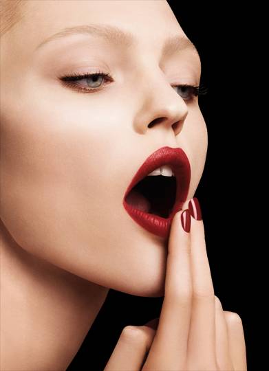
Throughout my study of the brand Armani, I have found that there is a profuse amount of action coming from the hands in ad campaigns and photo shoots. It adds a very feminine touch to the images and shows off their nail colour range- Something I might possibly recreate for my extra 5th final shoot. Body language is essential when recreating an image, it's essential that I look at all aspects of how Armani shoot their images, so I can instruct and direct my model for the best possible images.If I show some examples and then maybe you'll see what I mean.
http://talkingmakeup.com/beauty/giorgio-armani-beautys-new-lip-wax/ -04/03/15.

http://www.fashiongonerogue.com/patricia-van-der-vliet-elena-melnik-star-in-giorgio-armani-beauty-fw-2012-campaign/ - 04/03/15.
As you can see from the two images displayed above, hands not only add a very quaint and feminine touch, but are very noticeable in the shots and add to the overall look of the campaign. Whether it be the nails bare, with naked skin- it still portrays that more natural design. The hands, nails included also tend to match the lips of the model, showing that use of hands and also the use of coordination in Armani beauty campaigns. This will not only make my final shots look more fabulous but will make my work look more suited to the brand, and will really help to represent Giorgio Armani in the right way.
http://www.fashiongonerogue.com/catherine-mcneil-shines-in-giorgio-armani-beauty-spring-2013-campaign-by-txema-yeste/ - 04/03/15.
http://www.beautyscene.net/beauty-campaign/patricia-van-der-vliet-for-armani-beauty/ - 04/03/15.
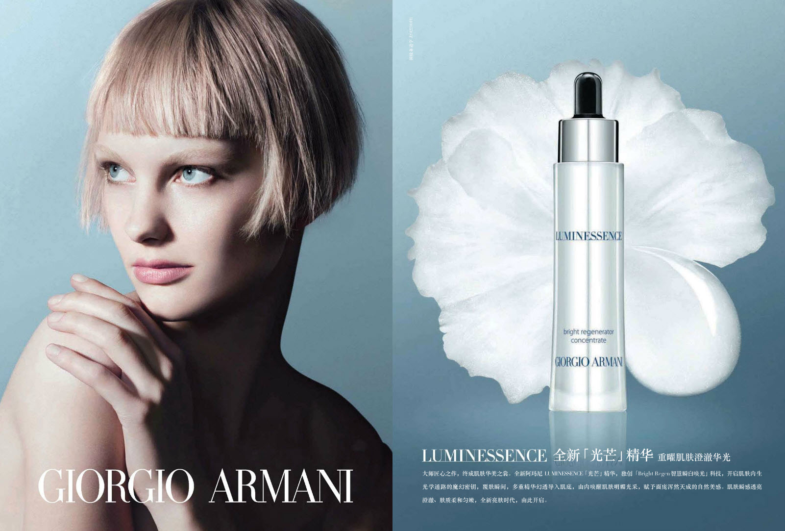
Not only do Catherine Mcneil and Patricia Van Der Vilet look absolutely stunning, but are designed based on a theme of colour. You wouldn't think that coordination in this day and age would still be fashionable, but it's making it's way back. The first image from Giorgio Armani's SS13 campaign, is a pink dream; everything is almost monochromatic but using very gentle and pastel shades of pink. The nails are a perfect light nude shade, almost a complete match to the pink background of the shot, the makeup and skin have an overall pink hue that of course has been done through editing, but the makeup itself is very natural, light and natural. Everything comes together with a pinky/ lilac theme to represent the look they were going for in the Spring Summer of 2013. The second image promoting the Giorgio Armani 'Luminessence' (Armani's own take on a brightening serum), is again, nothing over the top bright, but again very quaint, gentle and pastel-like in tone. The eyes are brought out even more with the background, and corresponding page that coordinated with the overall design. Armani have used a pale model with blonde hair to help lighten the use the blue, and brown hair for the first SS13 image, because brunette hair against a pink background is more stand out-ish and contrast. In the Luminessence advert the contrast is in the model's hair style- where she is sporting a very edgy, feathered crop cut. This contrasts the light, quaint and gentle theme of this design making it stand out even more.
Overall, it's very easy to see that the use of hands and coordination will be something I can re-create/ experiment with when designing my final looks. At the moment I am very keen on the idea of bare skin with props, because I feel that is something I have seen a lot of by Giorgio Armani. Hands whether they are bare, or in a certain position is all something I need to plan and work with my model to create. Coordination is also something that I need to experiment with whether it be in the makeup, props, overall design of the shoot/ set-up and even more importantly, how I choose to edit the images.
Subscribe to:
Comments (Atom)