USE OF HANDS & COORDINATION
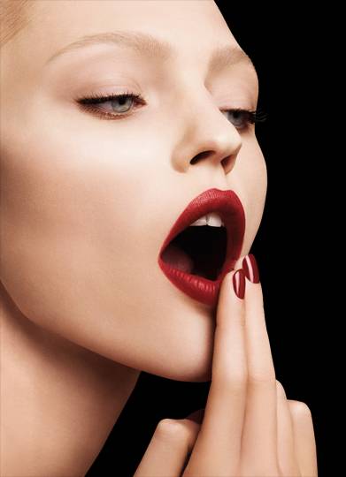
Throughout my study of the brand Armani, I have found that there is a profuse amount of action coming from the hands in ad campaigns and photo shoots. It adds a very feminine touch to the images and shows off their nail colour range- Something I might possibly recreate for my extra 5th final shoot. Body language is essential when recreating an image, it's essential that I look at all aspects of how Armani shoot their images, so I can instruct and direct my model for the best possible images.If I show some examples and then maybe you'll see what I mean.
http://talkingmakeup.com/beauty/giorgio-armani-beautys-new-lip-wax/ -04/03/15.

http://www.fashiongonerogue.com/patricia-van-der-vliet-elena-melnik-star-in-giorgio-armani-beauty-fw-2012-campaign/ - 04/03/15.
As you can see from the two images displayed above, hands not only add a very quaint and feminine touch, but are very noticeable in the shots and add to the overall look of the campaign. Whether it be the nails bare, with naked skin- it still portrays that more natural design. The hands, nails included also tend to match the lips of the model, showing that use of hands and also the use of coordination in Armani beauty campaigns. This will not only make my final shots look more fabulous but will make my work look more suited to the brand, and will really help to represent Giorgio Armani in the right way.
http://www.fashiongonerogue.com/catherine-mcneil-shines-in-giorgio-armani-beauty-spring-2013-campaign-by-txema-yeste/ - 04/03/15.
http://www.beautyscene.net/beauty-campaign/patricia-van-der-vliet-for-armani-beauty/ - 04/03/15.
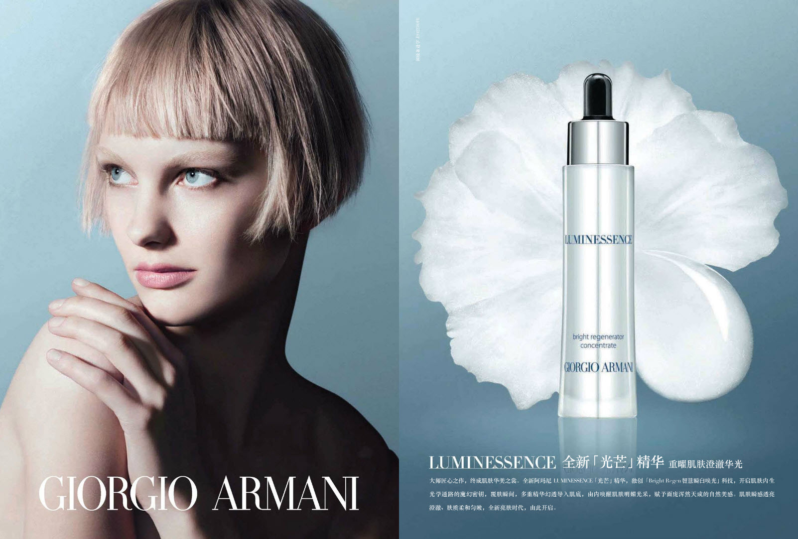
Not only do Catherine Mcneil and Patricia Van Der Vilet look absolutely stunning, but are designed based on a theme of colour. You wouldn't think that coordination in this day and age would still be fashionable, but it's making it's way back. The first image from Giorgio Armani's SS13 campaign, is a pink dream; everything is almost monochromatic but using very gentle and pastel shades of pink. The nails are a perfect light nude shade, almost a complete match to the pink background of the shot, the makeup and skin have an overall pink hue that of course has been done through editing, but the makeup itself is very natural, light and natural. Everything comes together with a pinky/ lilac theme to represent the look they were going for in the Spring Summer of 2013. The second image promoting the Giorgio Armani 'Luminessence' (Armani's own take on a brightening serum), is again, nothing over the top bright, but again very quaint, gentle and pastel-like in tone. The eyes are brought out even more with the background, and corresponding page that coordinated with the overall design. Armani have used a pale model with blonde hair to help lighten the use the blue, and brown hair for the first SS13 image, because brunette hair against a pink background is more stand out-ish and contrast. In the Luminessence advert the contrast is in the model's hair style- where she is sporting a very edgy, feathered crop cut. This contrasts the light, quaint and gentle theme of this design making it stand out even more.
Overall, it's very easy to see that the use of hands and coordination will be something I can re-create/ experiment with when designing my final looks. At the moment I am very keen on the idea of bare skin with props, because I feel that is something I have seen a lot of by Giorgio Armani. Hands whether they are bare, or in a certain position is all something I need to plan and work with my model to create. Coordination is also something that I need to experiment with whether it be in the makeup, props, overall design of the shoot/ set-up and even more importantly, how I choose to edit the images.
No comments:
Post a Comment